Digital Humanities
DH2010
King's College London, 3rd - 6th July 2010
Contexts, Narratives, and Interactive Visual Analysis of Names in the Japanese Hyohanki Diary
See Abstract in PDF, XML, or in the Programme
Toledo, Alejandro
Intelligent Computer Entertainment Laboratory
Global COE Program in Digital Humanities for Japanese Arts and Cultures
Ritsumeikan University
alex@ice.ci.ritsumei.ac.jp
Thawonmas, Ruck
Intelligent Computer Entertainment Laboratory
Global COE Program in Digital Humanities for Japanese Arts and Cultures
Ritsumeikan University
ruck@ci.ritsumei.ac.jp
Visualization tools for the discipline of history are being used increasingly. Historians can explore their efficacy as both educational instruments and platforms for displaying research findings. In order to obtain patterns of significance, historian’s work involves manipulating, memorizing, and analyzing substantial quantities of information from the series of documents at their disposal. In so doing, a central purpose emerges: the construction of a narrative that best fits into the representation of the past.
Visualization tools have proved to be effective for facilitating users’ analytical tasks (Heer et al., 2008; Heer et al., 2009; Weizhong and Chen, 2007, James and Cook, 2005). Moreover, they have proved to be fruitful in the context of the digital humanities (Bonnet, 2004; Dalen-Oskam and Zundert, 2004). Recently, we proposed a visualization system for analyzing aristocrat names in a Japanese historical diary called Hyohanki (Toledo et al., 2009). In our system, the stacked graph is utilized to analyze the time series of those names. Stacked graphs, stacking time series on top of each other, are a useful method to time series visualization, resulting in a visual summation of time series values that provides an aggregate view stratified by individual series. Projects such as NameVoyager (Wattenberg et al., 2005) and sense.us (Heer et al., 2009) used animated stacked graphs to explore demographic data.
In this paper, to preserve contexts through the stacked graph usage, we propose an extension of our previous work. Our system provides two functionalities: an interaction control for saving, querying, and deleting views, as well as a dynamic repository of views representing the context of the stacked graph usage. Keeping useful contexts facilitates coherent narratives (Bonnet, 2004). To support historians’ efforts in keeping contexts through interactive visual analysis of time series, both functionalities aim at recording how users receive units of information appropriated to construct narratives.
To analyze the end-user perception of our system, we conducted a heuristic evaluation (Nielsen, 1992) with a domain expert who explored the data using the tool. This heuristic evaluation was a form of user study in which the expert reviewed the system to suggest advantages and disadvantages against the new functionalities. This approach helps to further elucidate the requirements and how the system meets experts’ needs. The results provide useful guidance for highlighting known historical facts as well as hints to unknown historical facts.
Methodology
Our visualization system is based on a time series set containing the quantitative analysis of name occurrences in the Hyohanki diary. The set contains 121 time series in a timescale spanning from 1132 to 1171. Some parts of the diary suffer from missing data; for that reason, that period includes only the years 1132, 1139, 1149, 1152-1158 and 1166-1171. Likewise, the data has been normalized in order to measure the percentage relative value of the number of occurrences of a given name, in a given year, with the total percentage of that year. Additionally, using the Euclidean distance metric, we calculated the trends' similarity between time series. For each name, we recorded their five most similar trends.
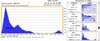
The method used to visualize the data is straightforward. Given a set of aristocrat names’ time series, a stacked graph is produced (Fig. 1a). The x axis corresponds to year and the y axis to the occurrence ratio — in percentage, as the data has been normalized —, for all names currently in view. The stacked graph contains a set of stripes, each one representing a name. The width of each stripe is proportional to the ratio of that name mentioned in a given year. The stripes are colored blue and the brightness of each stripe varies according to the number of occurrences, so that the most mentioned names during the whole period are darkest and stand out the most. Likewise, the name’s font size follows a similar encoding; the higher the occurrence frequency of a name, the larger its font size.
-
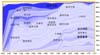
- a) Initial view

-
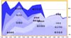
- b) Filtered view with occurrence
frequency above 200
Fig. 1 Screenshots of the stacked graph 1

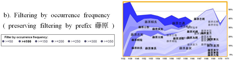
The interaction capability provided by our visualization system comes in two flavors. First, a stripe filtering mechanism allows users to filter the stacked graph in three ways: prefix typing, occurrence frequency, and stripe similarity. The second interaction control, which we call contextualization keeping, aims at keeping the views produced by users as they interact with the visualization system. Because stripe filtering acts as a view producer, and contextualization keeping as a dynamic repository of those views, we believe that both types of interaction controls embody a useful tool for visual exploratory analysis.
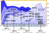
Stripe filtering forms the base for the source of views. Consider for example the interaction control for filtering by string prefixes (Fig. 2a). Users are allowed to type either a complete name or only a prefix of that name. The figure shows a view corresponding to the prefix 藤原 (family name Fujiwara). The number of possible views that this interaction control can produce is equivalent to at least the size of the time series set. The Hyohanki diary produces about 150 views from a total of 121 names.

-
- Fig. 2 Stripe filtering interaction controls

In addition to the stripe filtering, our system provides filtering by occurrence frequency (Fig. 2b), which uses a set of discrete values leading to seven possible views. Users, however, will likely want to combine the effects of more than one interaction control; for which case, the amount of possible views might increase enormously. An extreme scenario may occur when considering the last type of filtering, similarity of trends (Fig. 2c), which allows users to reveal those stripes that are similar to others. To cope with this issue, we propose in this paper a preliminary implementation for keeping the contextualization of the stacked graph usage.
Our proposal for keeping contextualization in the stacked graph is composed of two parts: a toolbar which users can use to save and delete views and a repository of the resulting views from the effects of the toolbar usage (Fig. 3). For each saved view, the system records contextual information of the current visualization state. This information is saved in terms of the stripe filtering interaction controls used to produce those views. In order to support their sense making tasks, users can operate on the toolbar, especially on the saving button, whose effect suggests a mapping between the intrinsic facts of the view with the user mental model created from that view. The repository, on the other hand, provides the stacked graph with the ability to serve as a cognitive tool. This is because users can recover views from the repository, reason on them depending on their own criteria, and decide whether to keep the view or delete it. The main attraction of our proposal is its potential provision of stacked graph’s usage paths as the results of a visual exploratory analysis.
-
- Fig. 3 Interaction control for keeping contextualization in the stacked graph

Results and Discussions
This work attempts to provide a stacked graph module for gathering views to construct narratives. A concrete prototype has been developed and evaluated with an expert. In general, our user had a favorable experience with the system, though he commented that the similarity filtering was confusing and should provide a more effective approach for this. Below we have an observation the expert was able to make using the tool.
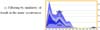
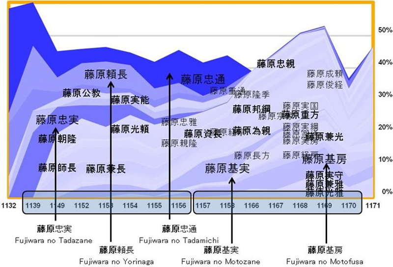
Fig. 3 shows a use case of our visualization system. Six views were saved into the repository using a deductive reasoning approach, i.e., going from the stacked graph as a whole to a view containing only one name. From those views, only three of them gained relevance to construct the narrative, i.e., views 2-4. As shown in Fig. 4, or View 2 of Fig. 3, there are no significant variations in the trends with prefix 藤原 (family Fujiwara) — to some extent they were mentioned over the same period —. However, the similarity view of 藤原忠実 (Fujiwara no Tadazane) in View 3 of Fig. 3 (see also Fig. 2c) excludes his eldest son 藤原忠通 (Fujiwara no Tadamichi). In contrast, Fujiwarano Yorinaga (藤原頼長) not only is a member of that group, but he has the most similar trend to his father (Tadazane). This situation was used to construct the following narrative: "Tadazane was possibly closer to his second son", which actually confirms a known historical fact.
-
- Fig. 4 Trends of family name 藤原 (Fujiwara) co-occurring over the same periods, View 2 from the repository in Fig. 3
References
- Bonnet, J. (2004). 'New Technologies, New Formalisms for Historians: The 3D Virtual Buildings Project'. Literary and Linguistic Computing. Vol. 19, No. 3: 289-301
- Heer, J. Mackinlay, J.D., Stolte, C. and Agrawala, M. (2008). 'Graphical Histories for Visualization: Supporting Analysis, Communication, and Evaluation'. IEEE Transactions on Visualization and Computer Graphics. Vol. 14, No. 6: 1189-1196
- Heer, J., Viegas, F. B., and Wattenberg, M. (2009). 'Voyagers and Voyeurs: Supporting Asynchronous Collaborative Visualization'. Communications of the ACM. Vol. 52, No. 2: 87-97
- James T. and Cook, K. (2005). Illuminating the Path: The Research and Development Agenda for Visual Analytics. National Visualization Center
- Nielsen J. (1992). 'Finding Usability Problems Through Heuristic Evaluation'. CHI '92: Proceedings of the SIGCHI conference on Human factors in computing systems. Pp. 373-380
- Toledo, A., Thawonmas, R., Maeda, A. and Kimura, F. (2009). 'Interactive Visual Analysis of Personal Names in Japanese Historical Diary'. DH2009. Maryland, USA, pp. 278-280
- Van Dalen-Oskam, K. and Van Zundert, J. (2004). 'Modeling Features of Characters: Some Digital Ways to Look at Names in Literary Texts'. Literary and Linguistic Computing. Vol. 19, No. 3: 289-301
- Wattenberg, M. and Kriss, J. (2005). 'Designing for Social Data Analysis'. IEEE Transaction on Visualization and Computer Graphics. Vol. 12 no. 4: 549-557
- Weizhong, Z. and Chen, C. (2007). 'Storylines: Visual Exploration and Analysis in Latent Semantic Spaces'. Computer and Graphics. Vol. 31, Issue 3: 338–349
Footnotes
- 1.
- Stacked Graph URL : http://www.ice.ci.ritsumei.ac.jp/~alex/infovis/hyohanki Back to context...
© 2010 Centre for Computing in the Humanities
Last Updated: 30-06-2010